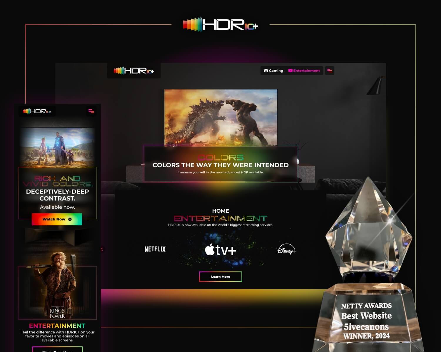
Creating Extraordinary Experiences.
Xperi’s tagline sets the bar above all other technology companies. And within their suite of brands and products, are some of the highest-quality streaming services to screens all over the world, in-cabin audio technologies that optimize music based on where people are sitting in a car, and new bleeding-edge tools meant to improve entertainment experiences in every device. Now how do we tell that story with a website redesign? Let’s roll.


Follow Process. Focus on the details.
Many website redesign projects all follow a similar process. They start with discovery, roll into strategy sessions with style guides, wireframing, and developing a robust sitemap. But when it’s time to color in (or out of) the lines, we let the brand lead. And Xperi, as a brand, is robust, comprehensive, compliant, smart, technological, advanced, and many other keywords we identify the brand as. Therefore, the website’s components need to reflect all of that. And they do, as it’s all in the details.


Navigate the Jungle of Content.
As it has been communicated, and shown above, this is a not a small brochure website redesign. There’s tons of content, for a range of users. How do we get investors to the content they want with one click – while also giving streaming service operators the ability to navigate to the brands their interested in, potential employees a pathway to find great career opportunities, consumers a place to learn about product launches, and educate partners about emerging technologies and upcoming events? We designed a simple mega menu experience, with different entry and interaction points, leading the different users to their destinations with ease.
Serious Privacy Compliance.
The Xperi.com website redesign deploys industry-leading user privacy and cookie compliance tools. A user in California can opt-out of being tracked, can request their info be destroyed and never shared, while someone in Brazil coasts through without being tracked or marketed to, as a user from Australia agrees to the terms and let’s us understand how to create a better user experience for them based on key engagement metrics.

A Website Redesign That Speaks Your Language.
The site also deploys a multi-language tool, translated by people and not AI. And although there is absolutely a place and a role for AI in a technology company’s website, it’s not in the way we are communicating and translating meaning to people. That takes a special craft, polished and practiced by copywriters who still hold out to pride and prejudice, to the five canons of rhetoric, and to the generations of learning how to communicate and connect through spoken and written word. It is the craft that supports a great technology experience, and is not replaced by one.


