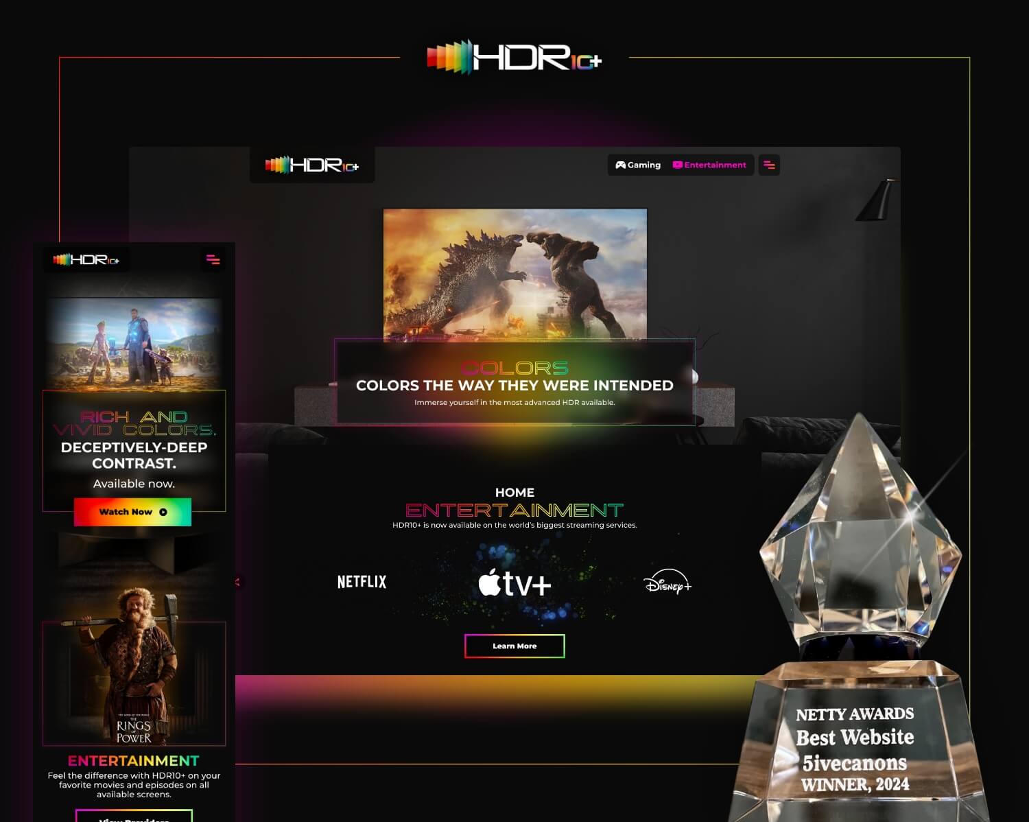
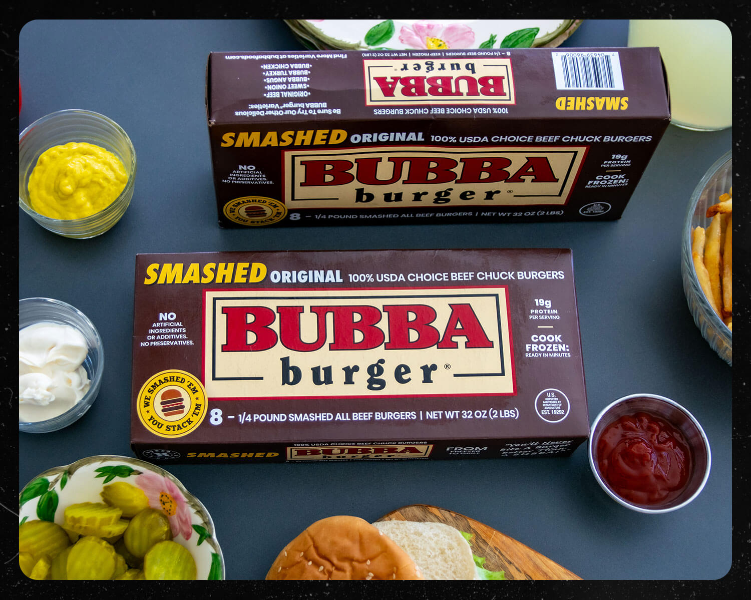
Interactive UI/UX Design for Food and Beverage
The interactive UI/UX design for food and beverage companies begins by understanding a client’s audience, what information they want to provide, and what they want users to do on the site. this is typically done in our Discovery process. The 5ivecanons team then builds wireframes that map out content architecture.
The client’s goals were to encourage users to spend more time on site clicking through multiple pages, searching and quickly finding recipes, locating a nearby store, learning about the ingredients, and watching videos on how to cook the perfect burger, every time. And the team did just that with interactive pages, internal linking, and high-quality desktop and mobile design for a high-quality product. Interactive UI / UX design for food and beverage is critical for brand engagement and loyalty.


Check out more of our interactive UI/UX design work here!


